- CLIENT : YouTube
- Architect of Record : Huntsman Architectural Group
- General Contractor : GCI
- Installation/Service : Senovva Systems Group
- LOCATION : San Bruno CA
- TIME SPAN : 9 Months
- DELIVERY DATE : Q3 2015
Gallery
Summary
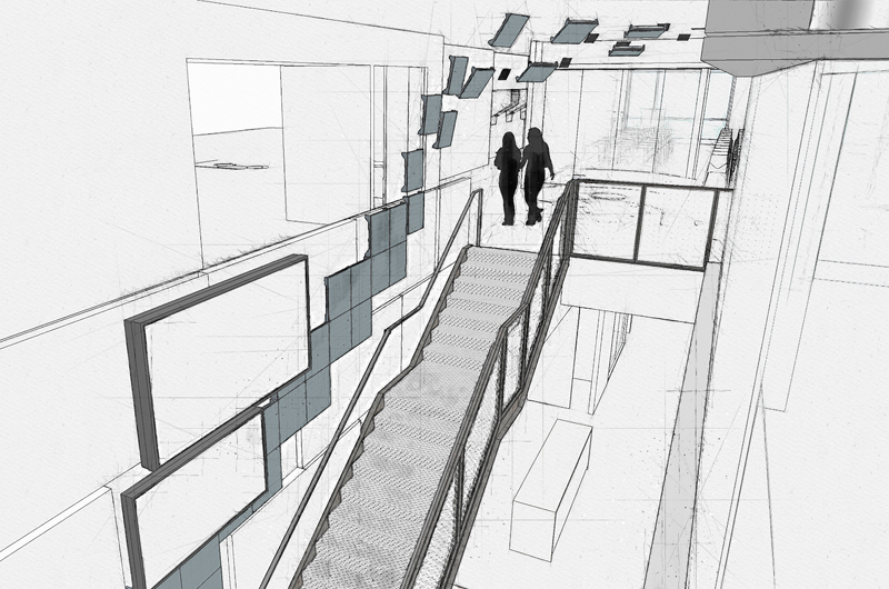
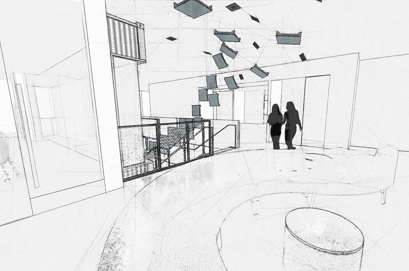
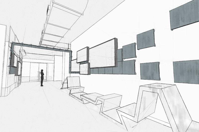
The architectural design intent was for the lobby to strongly feature YouTube is the world’s largest content management organization. The refit of the building itself included more than 12 individual moments/interactants throughout the facility. In this case, we are looking at the media systems installed in the lobby as a work of “Archi-media” design. That is, the media systems, and their dynamic content are actually built into the architecture and treatment of the lobby. As one might expect, the features in the lobby rely heavily on delivering the video-based content from YouTube’s vast repositories, and focus on their most current trending media. The project had several challenges uniquely suited to our integrated media systems design concepts. First and foremost, the original concept from the architects was limited to a single large, conventional, video wall comprising of four large displays. Client stakeholders wanted this to be something more than a large display stuck on a wall, and somehow involve the building itself. "Archi-media" feature concept design to integrate to interior design and structural needs. Fabrication design of structural and sculptural elements. Content campaign use and procedures. Media and content canvas master, and custom video server widget module design. CA level support with general contractor, carpenters, interior decorators throughout installation of project. Project oversight of content programming and use case training.
Our Unique Value To The Project
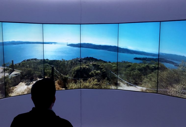
Given that the interior design concept for the lobby included a lot of exposed ceiling and utilities, our first goal was to use a raw industrial thing in our revised concept. Secondly, we wanted to make the sense of the vast amount of content controlled by YouTube throughout the world on the Internet was a key part of the statement. To this end, we designed a hybrid tile video ribbon treatment that encompass the entire room, and proceeded through the main office doors up to the second floor. This began with individual LED panels/pixels near the street entrance of the lobby that coalesced into a video ribbon. As the rigid ribbon proceeded through the wall of the lobby, in several locations large high-resolution displays videos would pop out of the passing video stream onto the displays. The ribbon continued up and over the main lobby in the ceiling, then re-coalesced in the opposite wall where it continued on until it wrapped a corner and ascended the main stairway to the second floor. There the LED ribbon dispersed into a custom video sculpture of multiple clouds of LED panels and disappeared into the remaining architecture. Symbolically, it was meant to show the stream of video coming into YouTube on a daily basis. It materialized out in the world transited into the building and disappeared into the resources of the YouTube structure itself. This was a significant scope increase for the original design, but moreover involved far more content design and management than ever intended. One of the most underestimated costs of media projects such as these is the actual content that will be displayed in “Archi-media.” In this case, it was further compromised by the fact that YouTube was not going to make the upkeep and refreshing of such content a priority of their content teams. They wanted something dynamic and automated. To that end we commissioned custom applet modules for a number of D3 video servers that could parse a live playlist of trending YouTube videos, either from their website, or overridden with keywords by the receptionist in the morning. These videos were presented in various formats on the high-resolution screens, while their color and audio were both scraped by the D3 servers to generate live content for the video ribbon’s and remaining displays. The end result is a constantly evolving content stream based on YouTube content itself. It does not require an operator, or content team to build custom content for the display. The entire feature refreshes its own content based on the ever-changing data from YouTube themselves. This third challenge was integrating the entire package into the interior cladding and to core structure of the lobby and stairway itself. This involved custom design and fabrication of the sculptural elements flying through the ceiling, as well as designing and fabricating the framework and adapting the cladding from the interior designer to make the video ribbon and displays actually part of the wall, not just hung on it. This required a fair amount of additional structural engineering, fabrication, and building design that neither the media systems integrator, nor the general contractor was prepared to do. In order to make this feature work as part of the building, we literally had to design part of the building itself.
3D Flythrough
An eros argumentum vel, elit diceret duo eu, quo et aliquid ornatus delicatissimi. Cu nam tale ferri utroque, eu habemus albucius mel, cu vidit possit ornatus eum. Eu ius postulant salutatus definitionem, explicari. Graeci viderer qui ut, at habeo facer solet usu. Pri choro pertinax indoctum ne, ad partiendo persecuti forensibus est.


